
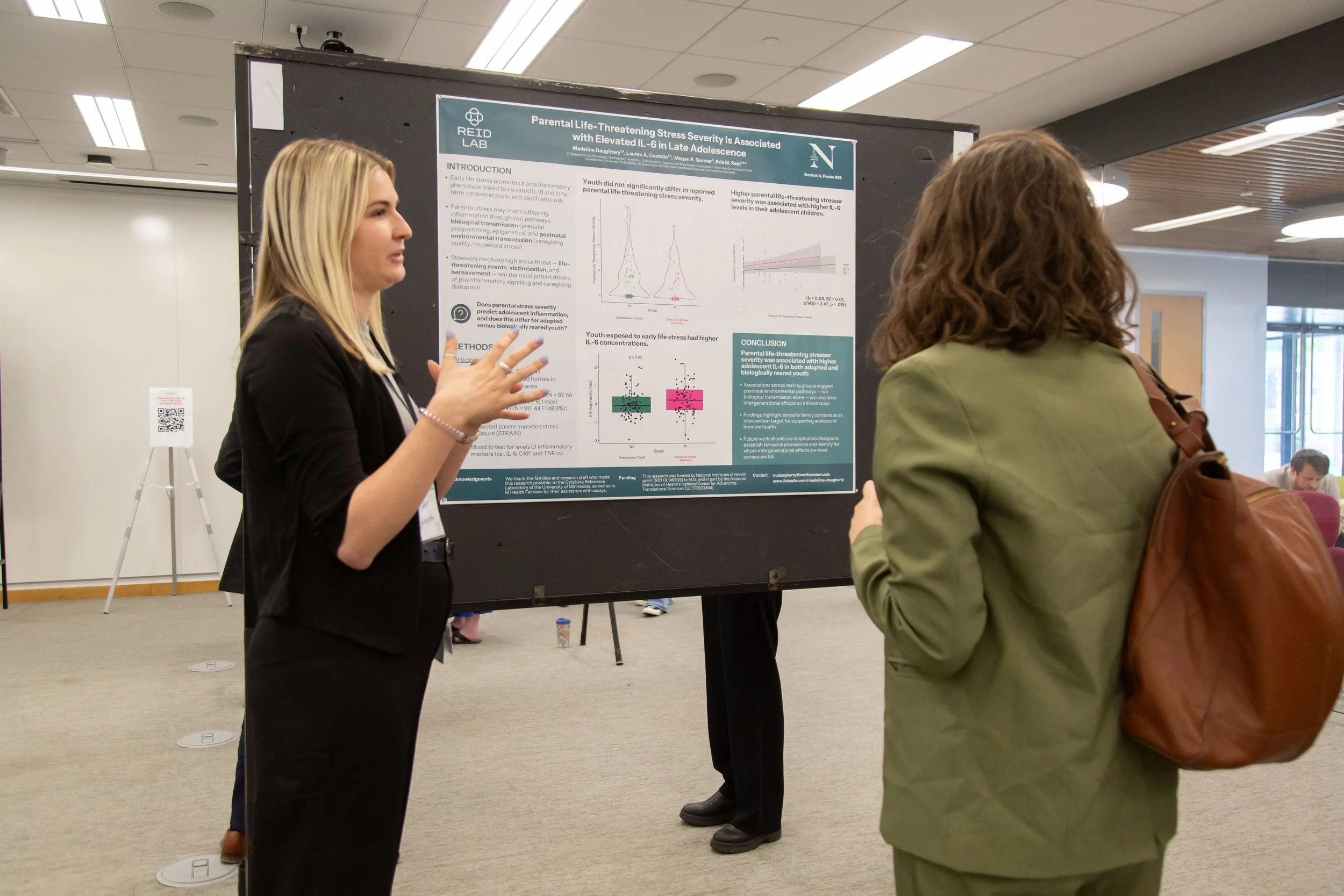
Poster Design for Academics
The number of poorly designed scientific posters I've seen over the years hurts my delicate sensibilities as a designer-turned-researcher. I've found myself on the receiving end of a lot of questions on poster design, so here are my tips.
If you read nothing else: design your poster with humanity in mind.
Step 1: start on a sheet of paper and keep it brief!
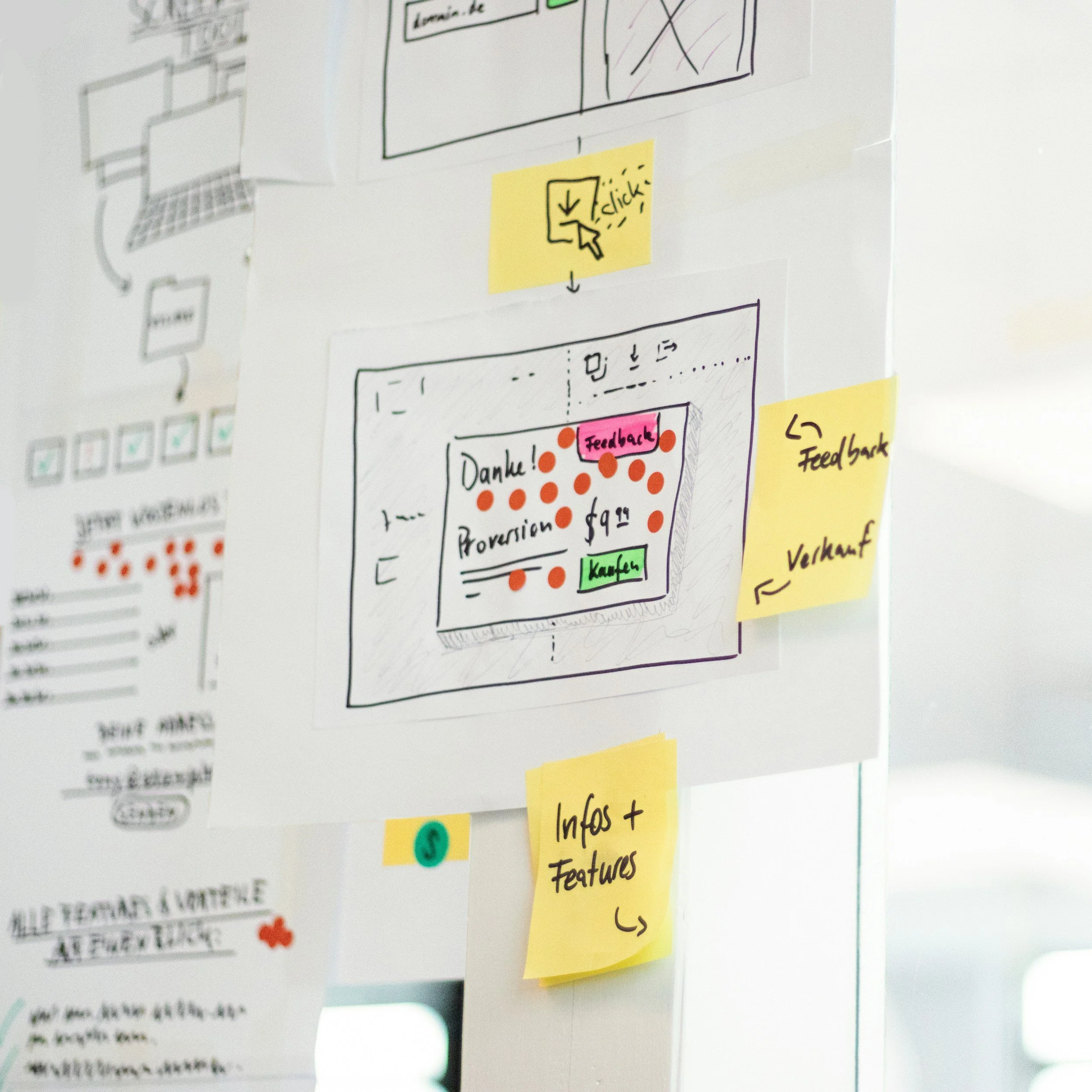
No one wants to stand for 20 minutes reading your poster in a sea of hundreds, and drawing a basic outline on paper first keeps you from agonizing over every pixel. Start with a piece of paper and write down:
The BIG Idea
The 1–2 sentence "big idea" you want any audience member to grasp from 30 seconds with you and your poster (e.g., "the literature suggests X but our study found the opposite"). Think about who your audience is and what they want to know.
The Requirements
Always make sure you follow conference formatting. So write down any sections required by the conference (abstract, intro, etc.). Sometimes it’s nice to have an easy thing to get going!
The Visuals
All the drawings, figures, graphs, and tables you want to include, prioritized by what you — as an audience member — would actually want to see. This may be similar to what goes in the paper, and it might differ. It can be helpful to think about not just the results figures, but also what are ways to visually show the methods and demographics? Are there big concepts you want the audience to understand?
Don’t be afraid to use icons or emojis!
A ROUGH Sketch
A rough rectangle sketch, generally blocking out where each section and figure will live. Keep it general — it's easy to get lost in the weeds here.
Example in action
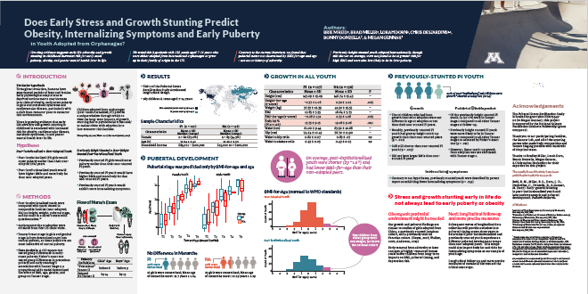
It is blurry on purpose, just focus on the overall layout.
The title is huge! I’ve also outlined 4 big takeaways in the title block at the top, with the authors, a fun photo, and a logo on the right
Notice how the Intro & methods are on their own “light grey” background, and I’ve used icons and photos to show the “big ideas” and the study visit details in methods.
Figures are key for visual interest; I wish I had not used so many tables. Notice the call-outs on certain figures to help with interpretation, and figure titles describe what the figure is in “big idea” language
My “discussion section” highlights the “big idea” in giant red font
Basic design principles are your friend
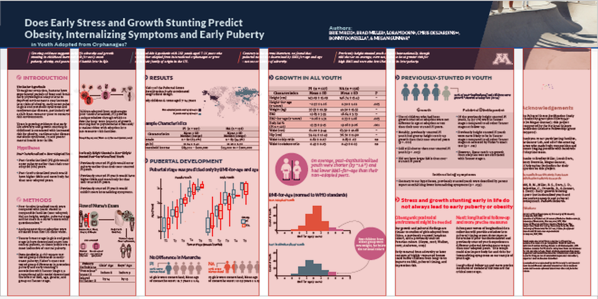
Use the power of the grid
Generous margins and a grid system will help you organize your poster.
A deeper overview on grids is here
Look at those gorgeous gridlines mapped to a poster below- and also note that WHITE SPACE (the gutter) is key to keep the grid in tact, and your poster looking sharp:
Pick 1–2 humane typefaces, and make them large
General size guidelines:
Title 85pt,
Authors 56pt,
Sub-headings 36pt,
Body text 24pt,
Captions 18pt.
My suggestion: pair a sans-serif for titles with a serif for body text. (Google Fonts pairing tool, more pairing examples)
Transfer your sketch to your design program of choice
You may find not all your figures realistically fit — that's fine, it may be time to prioritize your top 3–5. Once blocked out with the right font sizes, start filling it in, keeping everything aligned to your grid.
Let the first draft of this be messy and just get it generally where you want things to be!
I have been liking Canva for posters, because it’s easy to get going, share, and leave comments
Let it rest a day, zoom out, and make it cohesive
Take a day away, then come back with fresh eyes and zoom out to see the whole poster. Ask yourself:
Does my poster get the main message across?
Is there enough white space (does it feel crowded)?
Do I need to break up elements or change colors for more cohesion?
Is there a clear hierarchy of information?
If I saw this at a conference, would I be interested?